Graphical Surfaces
Grid Surface Control
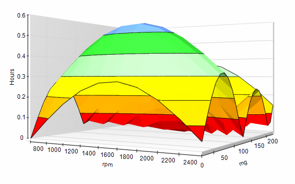
The Grid Surface Control provides a 3-dimensional grid surface.

Designer Properties
Appearance:
1. Border Style: The border to be displayed on the control.
2. XAxisLabel: The label to display for the x axis.
3. YAxisLabel: The label to display for the y axis.
4. ZAxisLabel: The label to display for the z axis.
Behavior:
1. Visible: A Boolean indicating if the control should be visible to the user.
Design:
1. Name: A name for the control in the surface designer and in the surface script.
Layout:
1. Location: The location of the control relative to its parent control.
2. Size:The size of the control.
Script Properties:
1. XAxisLabel: The label to display for the x axis.
2. YAxisLabel: The label to display for the y axis.
3. ZAxisLabel: The label to display for the z axis.
Script Methods:
InitializeGridSurface: Defines the grid that will be displayed.
Input Parameters
1. OriginX (Float): The origin for the x axis. This is the value for x index 0.
2. OriginZ (Float): The origin for the z axis. This is the value for z index 0.
3. StepX (Float): The step of the grid on the x axis. The value at a given x index is OriginX + (StepX * Index).
4. StepZ (Float): The step of the grid on the z axis. The value at a given z index is OriginZ + (StepZ * Index).
5. GridSizeX (Integer): The number of steps the grid should contain for the x axis.
6. GridSizeZ (Integer): The number of steps the grid should contain for the z axis.
SetValue Sets the Y value at the specified X and Z index.
Input Parameters
1. IndexX (Integer): The x index of the data point.
2. IndexZ (Integer): The z index of the data point.
3. Value (Float): The y value.
ClearData Clears the data in the grid, but preserves the grid defined by InitializeGridSurface
Image Rotation Control
The image Rotation Control rotates an image based on an its value.
It uses three images: a Background Image, the Rotation Image, and
the Foreground Image. The Background Image does not rotate, it is
used to display something below the rotated Image such as the scale
portion of a gauge. The Rotation Image is rotated based on the Value
and Stop Points assigned to the control. For a gauge, this would be
the pin. The Foreground Image does not rotate and is displayed over
the rotated image. Images will most likely require transparency, so it
is recommended to use .png images or another format that supports
transparency.
Designer Properties
APPEARANCE
BackColor: The color that appears behind the BackgroundImage. By default this
property is inherited from its parent control.
BackgroundImage: The image that appears below the RotationImage.
BackgroundImageLayout: The layout for the BackgroundImage. By default the layout is set to
Center, which will center the image as long as it is smaller than the
control.
ForeColor: A color used for drawing a line to show the rotation if no Rotation-
Image has been set.
ForegroundImage: An image that appears over the RotationImage.
ForegroundImageLayout: The layout for the ForegroundImage. By default the layout is set to
Center, which will center the image as long as it is smaller than the
control.
RotationImage: The image that will be rotated based on the Value and StopPoints
assigned to the control. The center of this Image will be rotated
about the RotationPoint.
Value: The value the control is currently displaying. If a value is out of
range, the minimum or maximum value will be displayed.
BEHAVIOR
Visible: A Boolean indicating if the control should be visible to the user.
CANBUS
Signal: A signal which will be used at runtime to set the Value of the control.
DESIGN
Name: A name for the control in the surface designer and in the surface
script.
LAYOUT
Location: The location of the control relative to its parent control.
Size: The size of the control.
ROTATION
Rotation: Defines the rotation. The rotation consists of a Boolean indicating
if the rotation is clockwise or counter clockwise and a collection of
Stop Points.
Clockwise: True if rotation is clockwise, otherwise False.
StopPoint: A value and rotation angle that represents the value. The rotation
angle for values between StopPoints is calculated based on
a linear scale between the StopPoint less than and the StopPoint
greater than the value. A StopPoint must be defined for the Minimum
and Maximum values.
Value: The value this StopPoint represents.
Angle: The rotation angle that should be used for the provided value.
RotationPoint: The point within the control where the center of the rotation Image
aligns. This RotationImage rotates about this point based on the
Value and StopPoints assigned.
Designer View
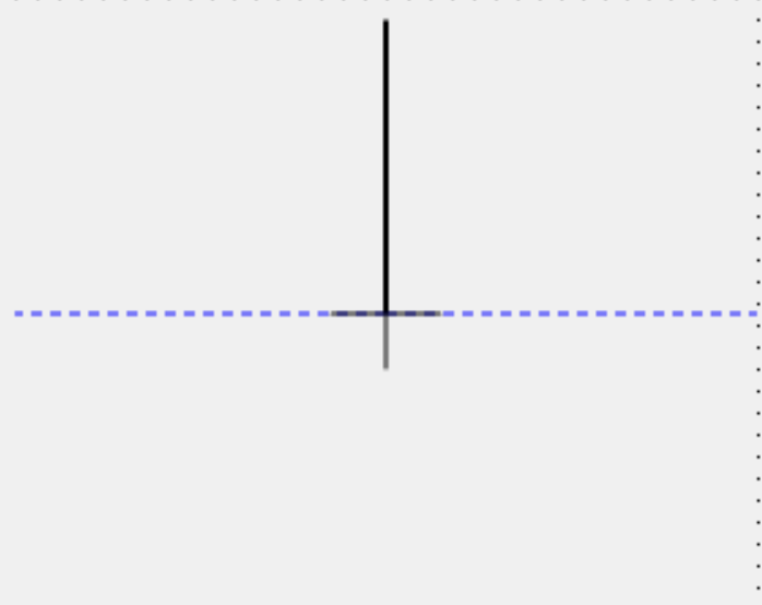
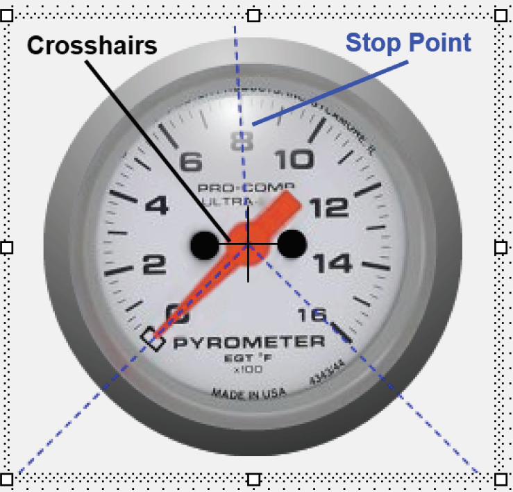
In the Designer you will see the crosshairs and the stop points. The
stop points are represented by blue dashed lines. The crosshairs and
stop points are only visible in the designer, and are provided to help
align the rotation.

Example Surface
This surface contains examples of the Image Rotation Control.

Script Properties
StopPointCount (Integer): Gets the number of StopPoints defined on the control.
Value (Float): Gets or Sets the current value the control is displaying.
Script Methods
AddStopPoint: Adds a stop point to the control.
InputParameters:
> Value (Float) The value this stop point represents.
> Angle (Float) The rotation angle that should be used for the provided value.
> ClearStopPoints Clears all StopPoints.
> GetStopPoint Gets a stop point by index.
InputParameters:
> Index (Integer) The index of the stop point to get.
OutputParameters
> Value (Float) The value this stop point represents.
> Angle (Float) The rotation angle that should be used for the provided value.
> RemoveStopPoints Removes a stop point by index.
InputParameters:
> Index (Integer) The index of the stop point to remove.